HeyHappy! • My role: UX Researcher, Designer
Background
I started dealing with major health issues in my mid-20s. As a result, I also developed a panic disorder.
I had no idea.
The doctors I saw didn't have a diagnosis for the symptoms I was experiencing. I later learned about anxiety from friends and learned more about it through my own research and eventually, therapy. In thinking about my own experiences, I wanted to design and create a mobile application for those struggling with or for those wanting to learn more about mental health.
Research Objectives
• To identify what resources or tools would be helpful to provide to someone who:
What are users currently doing to manage their mental health?
• Is not familiar with the mental health issues they are dealing with?
• Is already familiar but would like to learn more?
• Is very familiar?
• To understand how people are currently managing their mental health.
• To identify what users like or dislike in their current processes.
• Is already familiar but would like to learn more?
• Is very familiar?
• To understand how people are currently managing their mental health.
• To identify what users like or dislike in their current processes.
Main Research Questions
What are users currently doing to manage their mental health?
Methodology & Procedure:
• Customer Interviews: Conduct in-person and remote interviews with people dealing with anxiety, depression, generalized OCD, etc. to better understand how they learned about and currently manage their condition on a day-to-day basis.
• Prototype Testing: Provide users with an interactive prototype and have them complete two tasks. Gather qualitative feedback.
Step 1: Defining Research Objectives
I met with my mentor to understand how to narrow down the scope of this problem. We agreed that for the sake of this case study, I would focus on interviewing people on the topic of mental health management and education.
My goals for HeyHappy! were to provide: a sense of community, education and support, and the ability to notify selected contacts or emergency services.
Step 2: Recruiting Participants
Participants were recruited through a mix of personal and extended networks. All interview participants were dealing with anxiety, depression and/or OCD. I made sure to include people from different genders, ages, races, and national origin, to get a better understanding of how these issues may vary across cultural narratives.
Step 3: Conducting User Interviews
• 5 participants
• 30-60 minute sessions
• In-person and recorded video calls via Zoom
I asked questions like:
• What tools do you use to manage your mental health?
• How did you learn about anxiety / depression / OCD?
• What would have been helpful at that time?
• What would help someone help you now?
• How did you learn about anxiety / depression / OCD?
• What would have been helpful at that time?
• What would help someone help you now?
These interviews provided valuable insights into mental health apps and tools, as well as the frustrations and loneliness of mental illness.
With these findings, I was able to create two user personas encompassing the thoughts, feelings, and frustrations of people dealing with mental illness.
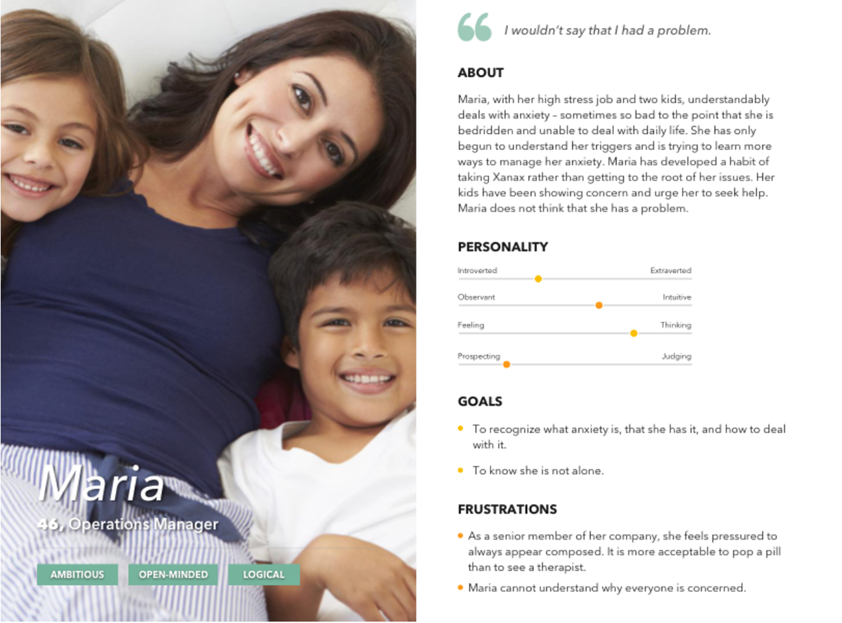
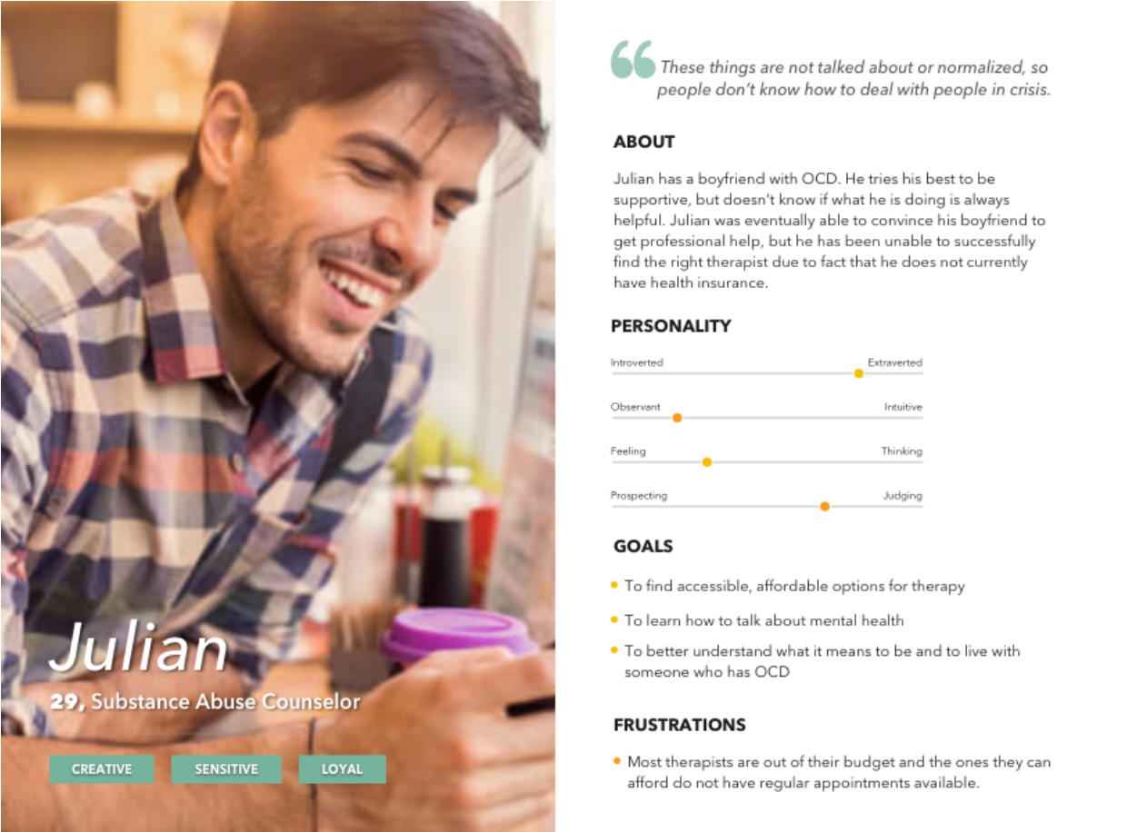
User Personas: Maria and Julian
Step 4: Analyzing Interview Data
While interviewing my participants, I took my own notes either with shorthand in a Word document, or via the Notes app on my mobile phone. I tried to take down direct quotes when possible. In the future, I would record the interviews so that I can focus solely on the conversation at hand.
Once I had all the transcripts on hand, I coded them accordingly:
• Mental Health Management: What tools are currently being used?
• Education: How do people first learn about mental illness? How do they continue learning?
• Desires: What do people want to have? What do they wish existed?
• Frustrations: What struggles exist when dealing with mental illness?
• Stigmas: What prevented people from receiving the help they needed?
• Education: How do people first learn about mental illness? How do they continue learning?
• Desires: What do people want to have? What do they wish existed?
• Frustrations: What struggles exist when dealing with mental illness?
• Stigmas: What prevented people from receiving the help they needed?
In reading through all the notes, common themes and patterns practically jumped out at me. Regardless of age, ethnicity, national origin, or even mental illness, it was easy to see that at the core of it all, mental health ties us together.
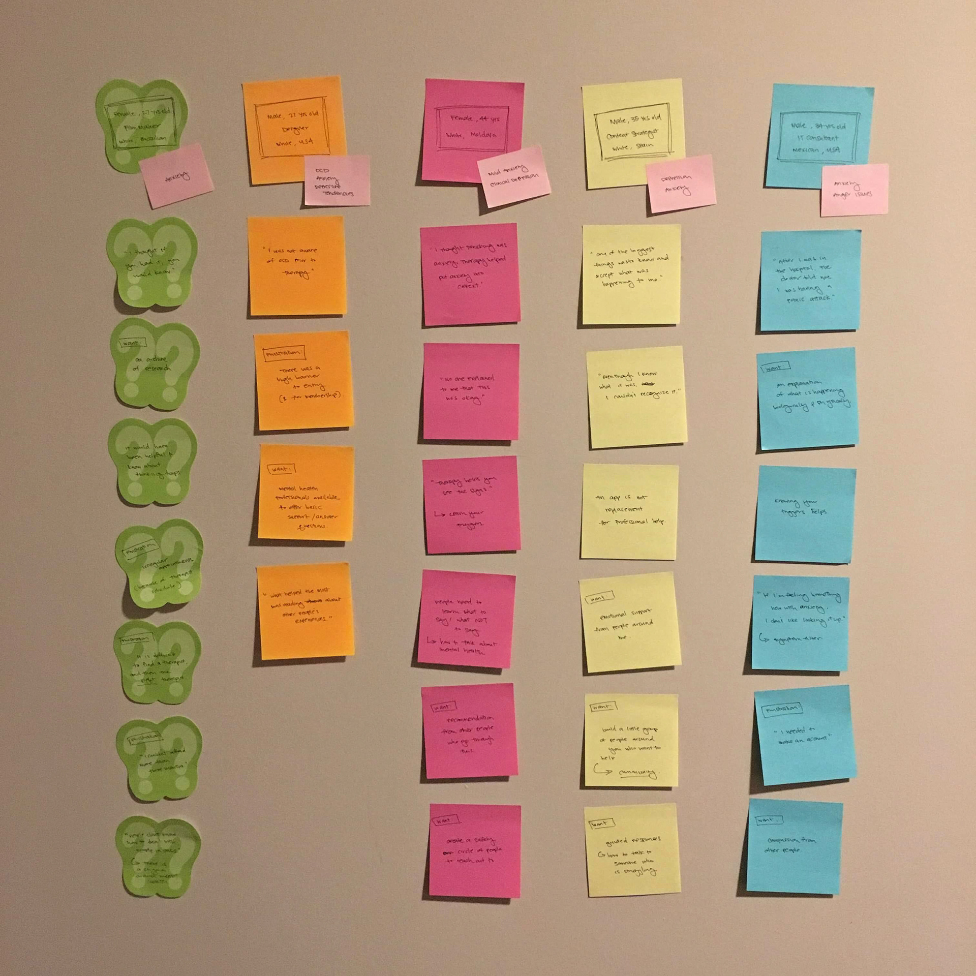
Coding Interview Findings
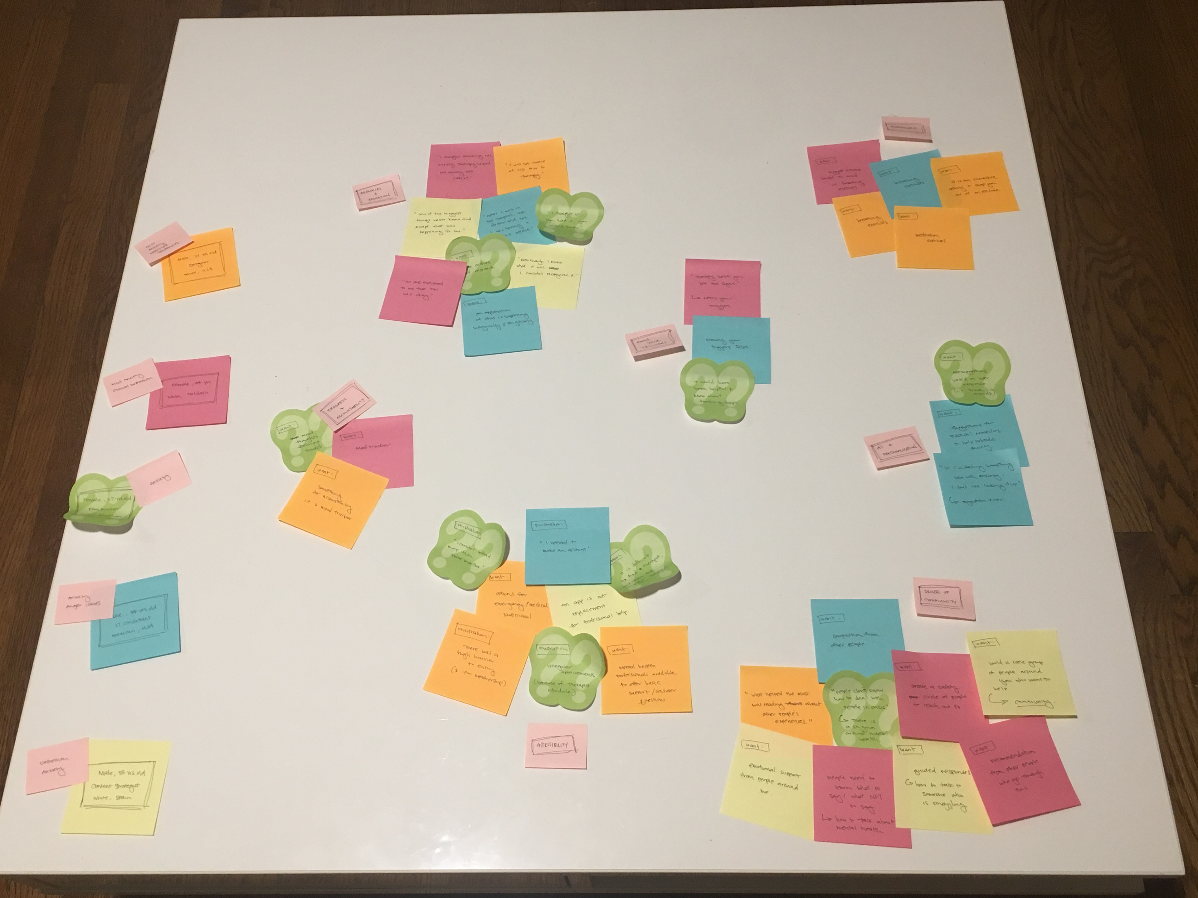
Grouping Findings Based on Common Themes / Patterns
Step 5: Low Fidelity Prototype Testing & User Feedback
Iteration #1:
• 3 participants
• 3 participants
• 15-20 minute sessions
• In-person
During the interview process, I was able to gain an understanding of what apps and tools users were currently using. I downloaded each app and went through them as a new user dealing with anxiety. In doing this, I was able to come up with a starting point for HeyHappy! Given more time, I would have conducted a more formal competitive analysis of each app and their features.
I created a low-fidelity prototype of HeyHappy! by sketching wireframes on paper and stitched them together using Marvel. Users were given the following prompt: You have not been feeling well lately, but don’t know if there is actually something wrong. You are using this app to figure out what is happening to you.
I instructed users to think aloud as they clicked through the prototype.
Iteration #2:
• 10 participants
• 15-20 minute sessions
• In-person
Based on this feedback, I created a high fidelity prototype via Sketch and Invision. I recruited 10 new users to test. They were given two separate prompts.
Task #1: You have not been feeling well lately, but don’t know if there is actually something wrong. You are using this app to figure out what is happening to you.
Task #2: You have been dealing with anxiety for the past few years. You are using this app to find someone qualified to talk to.
Users expressed some confusion over how to get started and had a lot of opinions about the color choices and the formatting. This led me to make a few changes. I added a frame with more text hopefully explaining how to navigate according to which situation users identified with. I also ended up choosing a new color palette for the app altogether. The newly-designed HeyHappy! was a mix of calming colors (blue, sage, grey) and warm, positive colors (yellow, orange).
Users expressed some confusion over how to get started and had a lot of opinions about the color choices and the formatting. This led me to make a few changes. I added a frame with more text hopefully explaining how to navigate according to which situation users identified with. I also ended up choosing a new color palette for the app altogether. The newly-designed HeyHappy! was a mix of calming colors (blue, sage, grey) and warm, positive colors (yellow, orange).
Learning Outcomes
I had a lot of big dreams for this app - dreams bigger than the few weeks that I had allotted for this project. The biggest issue I had with HeyHappy! was being too close to the idea. I often had a clear idea of what I wanted the app to be and what I wanted it to look like. But in reality, this app is not for me. I needed to learn how to let go and remain as unattached as possible.
What I would do differently:
• Record my interviews and use an app for transcription in order to give my participants my full attention.
• Have users do a diary study or video diary study documenting their day to day experiences with mental illness.
• Conduct a competitive analysis / feature review of other mental health management apps.
• Conduct post-test surveys to gather metrics in regards to design efficiency.
What I would do given more time and resources:
• Mental health professionals would be directly tied in to verify information and to offer assistance.
• Mental health professionals would be directly tied in to verify information and to offer assistance.
• I would incorporate the use of AI and machine learning so the app would remember your history and be able to:
• Track your mood/suggest things to try in order to improve.
• Personalized categories and results for articles or videos.
• Expand the issues covered by the app (i.e. more than just Anxiety, Depression, OCD).
