Client: Nomad Paradise • My role: UX Researcher
Summary
Background
Nomad Paradise is a website created for travelers by travelers. The content currently includes trip inspiration, travel tips, food, remote work, and travel gear. The creators of the website have been looking into the idea of adding a job board for remote jobs. They determined they needed to get more insights from remote job seekers and digital nomads about their current process in order to create a tool that is truly remote-focused.
Research Objectives
• To understand what remote workers like and dislike in a job search engine.
• To understand how remote workers are currently searching for jobs.
• To identify how the job search process can be improved for remote workers.
• To understand how remote workers are currently searching for jobs.
• To identify how the job search process can be improved for remote workers.
Main Research Questions
What methods are remote workers using to find jobs (websites, networking, other)?
Methodology & Procedure:
• Customer Interviews / Ethnographic Study: Meet with remote workers and hiring managers to gain insight into current job search processes. Ask users to simulate a job search and walk me through their process.
• Early Stage Prototyping: Build off the existing website and create a wireframe prototype of the job board based on user feedback gained from the interview process.
• Usability Study: Provide users with a task using and have them answer a quick survey about their experience. Gather qualitative feedback.
Step 1: Meeting with the Client
I met with the client over video chat to discuss their vision for the future of their website. We discussed an idea they had been looking into but have not had time to flesh out on their own. As remote workers ourselves, we were able to name a few competitor websites and share anecdotal information. I set expectations on what they could expect as a result of this project.
Step 2: Customer Interviews / Ethnographic Study
• 6 participants
• 15-30 minute sessions
• Recorded video calls via Zoom
After the call with the client, I was able to come up with a list of questions to use as a guideline for user interviews.
Over the course of 2 weeks, I met with a mix of people who were remote due to the pandemic, have always had the flexibility to be remote, and remote workers who also were hiring managers. Participants were recruited through a mix of personal networks and internet outreach. For remote employees, the questions were focused on their personal experience with job searching. For hiring managers, the discussion began with how a job listing is created. They were able to share details on what goes into finding remote employees, in addition to providing feedback on their own experiences.
I asked participants to share their screens in order to demonstrate how they currently search and apply for jobs. I prompted users with questions about why they chose certain actions and encouraged them to over-explain their actions.
All interviews were conducted and recorded over Zoom.
These interviews provided valuable insights into the job search process of remote workers, frustrations with competitor job sites, and feedback about a job board focused on remote work.
• "[Indeed] really felt like an absolute black hole."
• "I like that [LinkedIn] recommends positions based on my profile."
• "A lot of websites tend to have really bad filters. They're not useful because they don't work."
• "I want to know that I can trust what's [posted about] reviews or with salary."
• "Sometimes you can only pick one location when there are multiple you are open to."
• "It says quickly in the second paragraph that it's going to be “remote,” but at the same
time, 'You should be able to relocate to Colorado.'
With these findings, I was able to craft a user profile to fit the needs, desires and pain points unique to remote workers.
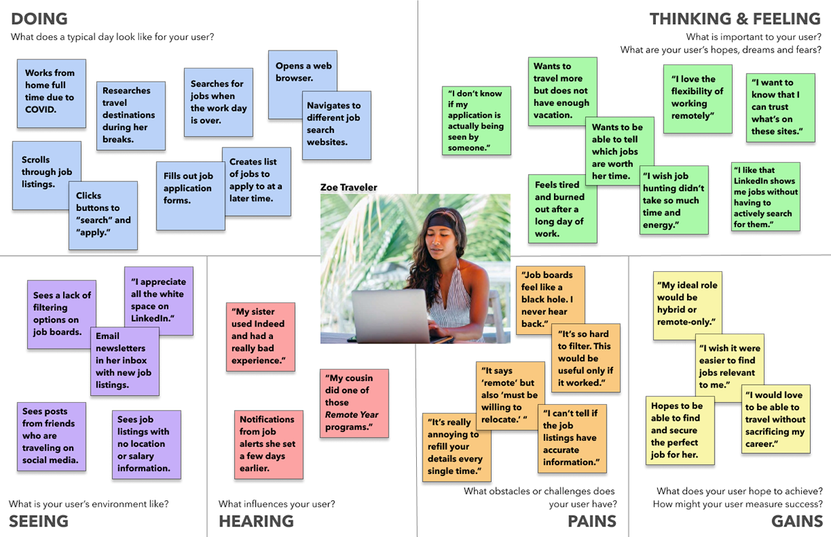
Empathy Map
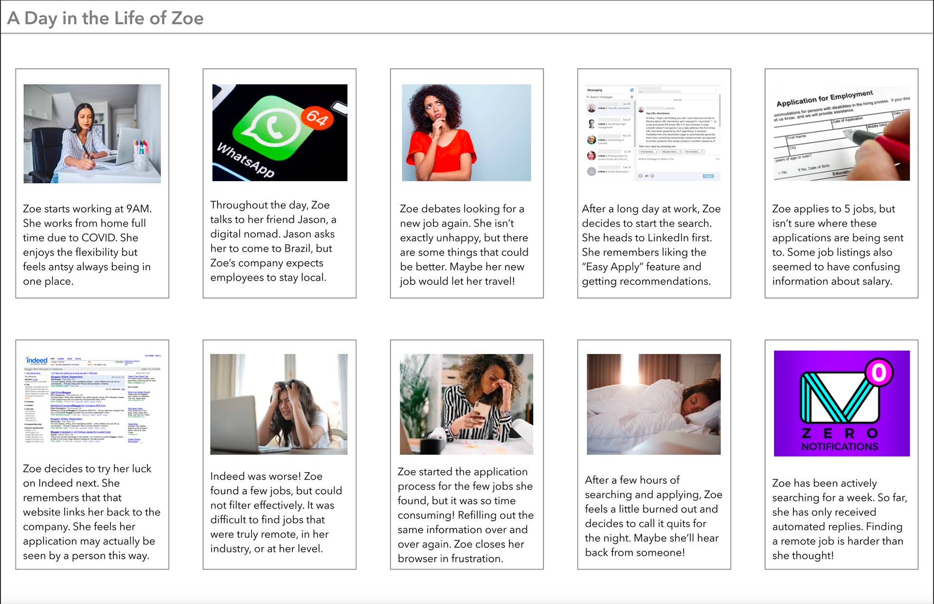
Storyboard
Empathy Map & Storyboard for Zoe: our remote worker
These deliverables were shared with the users. I sat with them as they read through the empathy map and storyboard, and asked them to freely comment on the information at hand.
This confirmed that there was certainly a market for a remote job board.
Step 3: Prototype Creation & Testing
• 6 participants
• 15 minute sessions
• Recorded screen share via Zoom
• Users click through prototype and provide open feedback and impressions
Using the existing landing page for Nomad Paradise, I created a clickable wireframe prototype using the features that users liked from competitor sites, while omitting the features that users disliked. My goal was to be able to provide the client with a starting point if they decided to move forward with implementation, even though my focus is on research.
Iteration #1: Once the prototype was completed, I facilitated two remote usability sessions over Zoom. I provided a link with a clickable prototype to the participants and instructed them to share their screens. Users were given the task: Please search and apply for a UX Researcher job. I asked them to talk through their thought process and provide any feedback on the website that they wished.
Both people expressed confusion over which tab to click in order to get to the job board. I asked questions like:
• Where do you want to click?
• What is your first instinct?
• What is your first instinct?
The wording of tabs for "Remote Work" and "Job Board" were too similar. Participants thought of these as the same thing. Both users were able to get to the intended location, but the task was not as straightforward as we would have liked.
This initial feedback was a setback and led me to quickly redesign the landing page. I added a banner at the top to indicate a new feature, in hopes of providing clarity for our users.
Iteration #2: I recruited four new users to test the changes and provide additional feedback. These sessions were moderated with the same settings and given the same task as the first two.
All users moved through the flow quickly and without issue. Participants had a lot to say about the site formatting, additional features to be added, wording that they found confusing, etc. I prompted feedback with questions like:
• Tell me your first impressions of this website.
• What, if anything, would you do differently?
• What, if anything, would you do differently?
My main goal with this feedback was to transform them into actionable insights.
Step 4: Usability Study
• 13 participants
• 5 minute click test via UsabilityHub
• Users follow a prompt and answer a quick survey about their experience
Since the user flow was unclear during initial testing, I created a test for the revised Landing Page via UsabilityHub to see if this problem had been resolved.
Participants were recruited via Internet outreach. Each user was sent a link to the usability test to complete on their own. They were given the same prompt from prototype testing: Please search and apply for a UX Researcher job. After the task was completed, they had the option to complete a quick survey with questions about their experience. The questions included were:
Participants were recruited via Internet outreach. Each user was sent a link to the usability test to complete on their own. They were given the same prompt from prototype testing: Please search and apply for a UX Researcher job. After the task was completed, they had the option to complete a quick survey with questions about their experience. The questions included were:
• How confident do you feel that you clicked on the right location? (1 - 5)
• What should be the correct navigation?
A long-form response box was also included for any additional feedback.
• What should be the correct navigation?
A long-form response box was also included for any additional feedback.
8 out of 15 users were "very confident" in their actions and clicked on the intended locations. This data confirmed that the redesign increased usability.
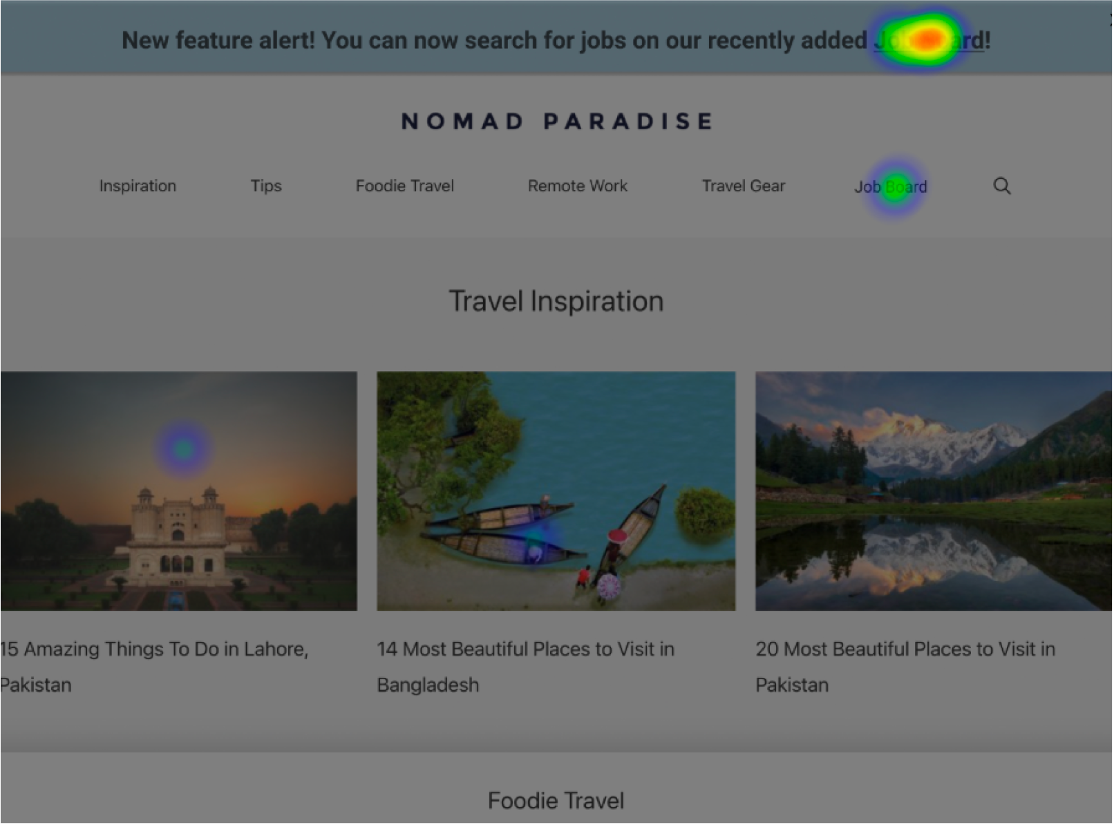
Heat Map Test
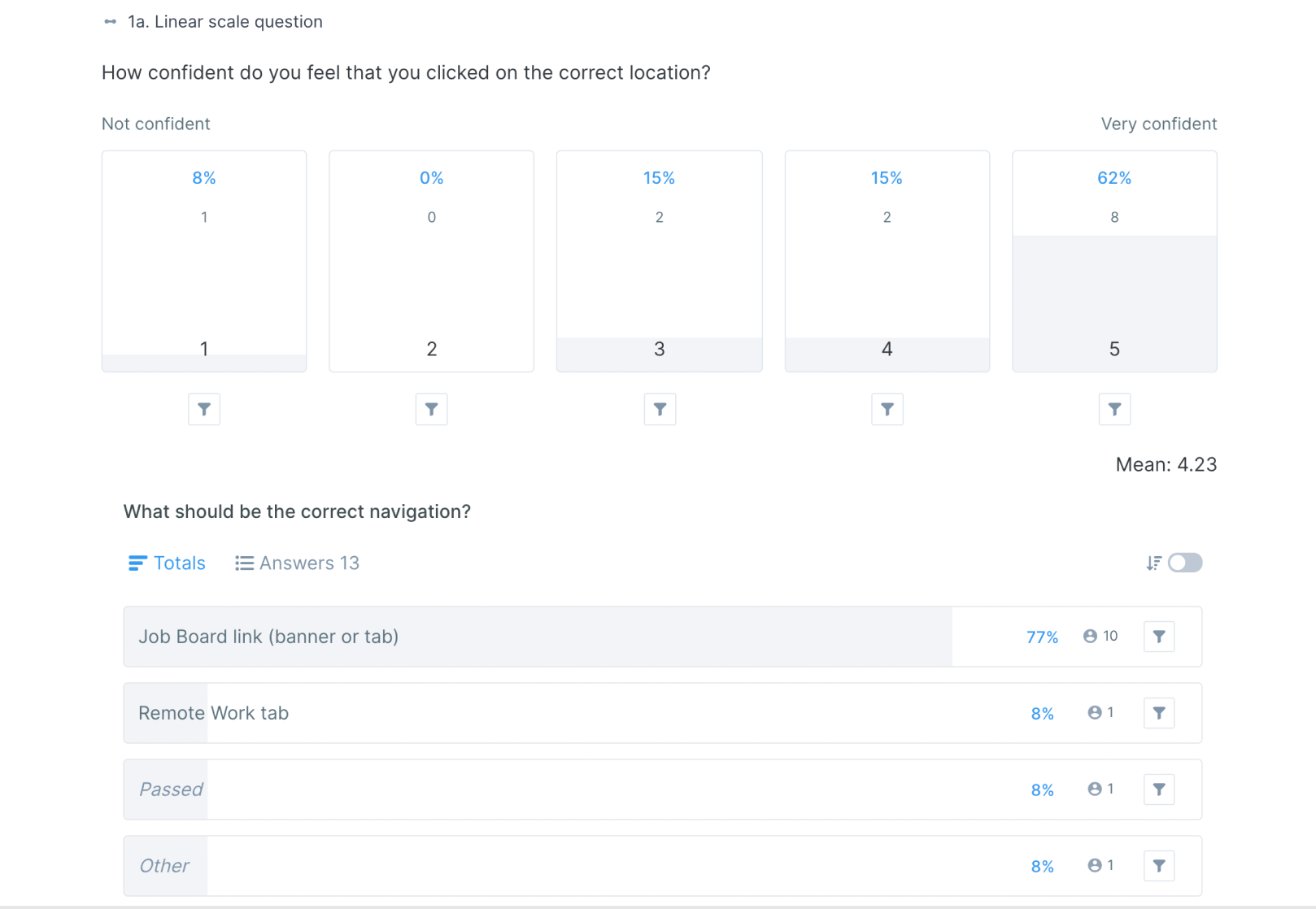
Survey Questions
Usability Test: Heat Map and Survey Questions
Results
Sample Sections of Client Report
I created a detailed report of participant feedback including opinions of the website, design, and features, along with supporting quotes to highlight user thoughts and feelings. To simplify the information, I included a section of takeaways consisting of trending user opinions. This feedback was grouped into a section on the report marked "Takeaways."
I met with the client again over video chat to debrief and review findings from my research.
I met with the client again over video chat to debrief and review findings from my research.
Overall, I was able to provide the client with:
• A list of features that users found useful and features that users disliked on competitor websites.
• A simple prototype for a potential job board.
• A high-level overview of user opinions for the current landing page.
• A number of actionable insights for post-implementation.
